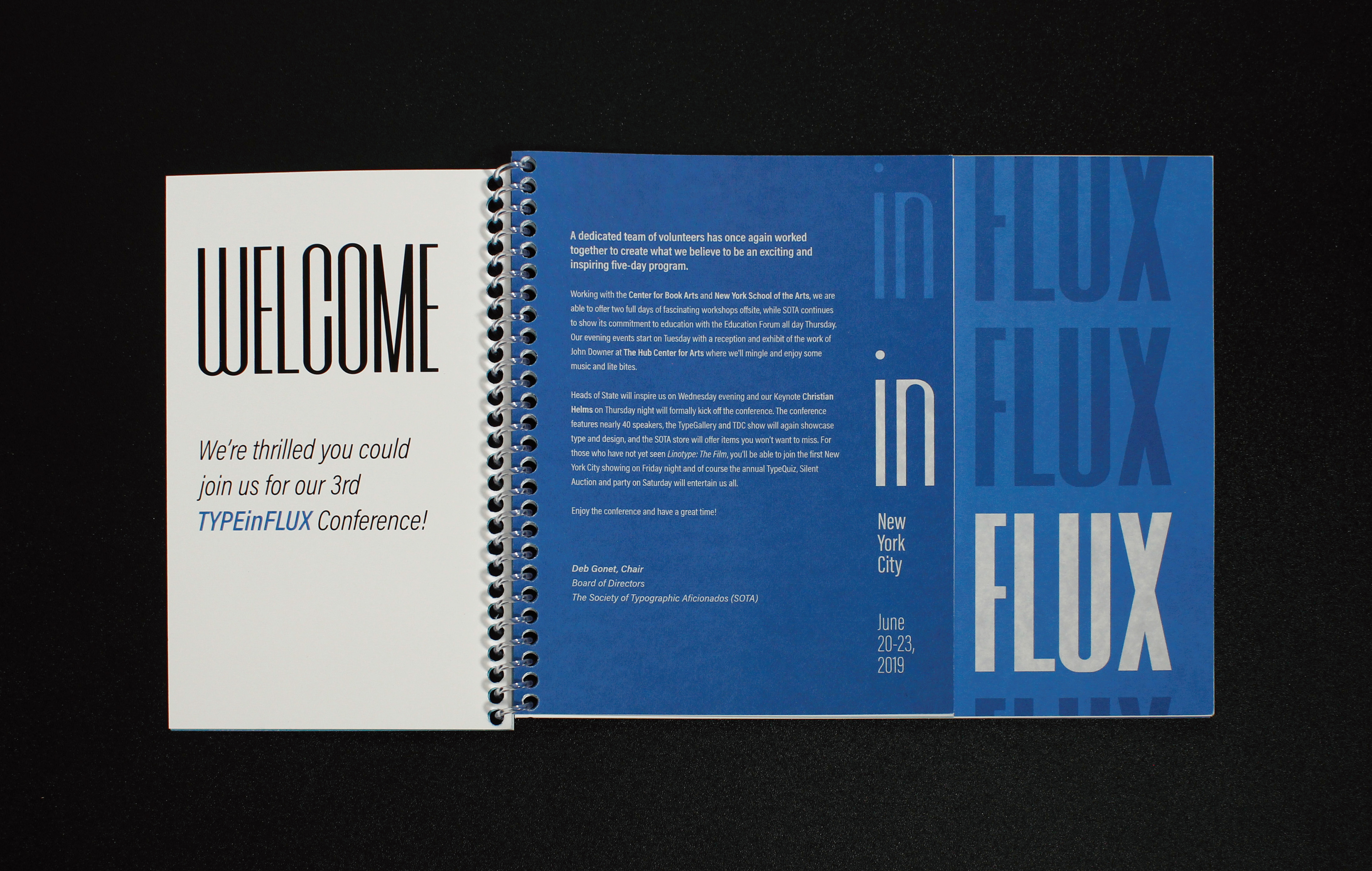
TYPEinFLUX is an imaginary conference which observes the influx of people, energy and ideas into the typographic world while questioning what it means to be in flux. Based on the theme of variable typefaces, the concept of TYPEinFLUX is visualized as a typographic system based on repetition (representing influx) and variation (being in flux).
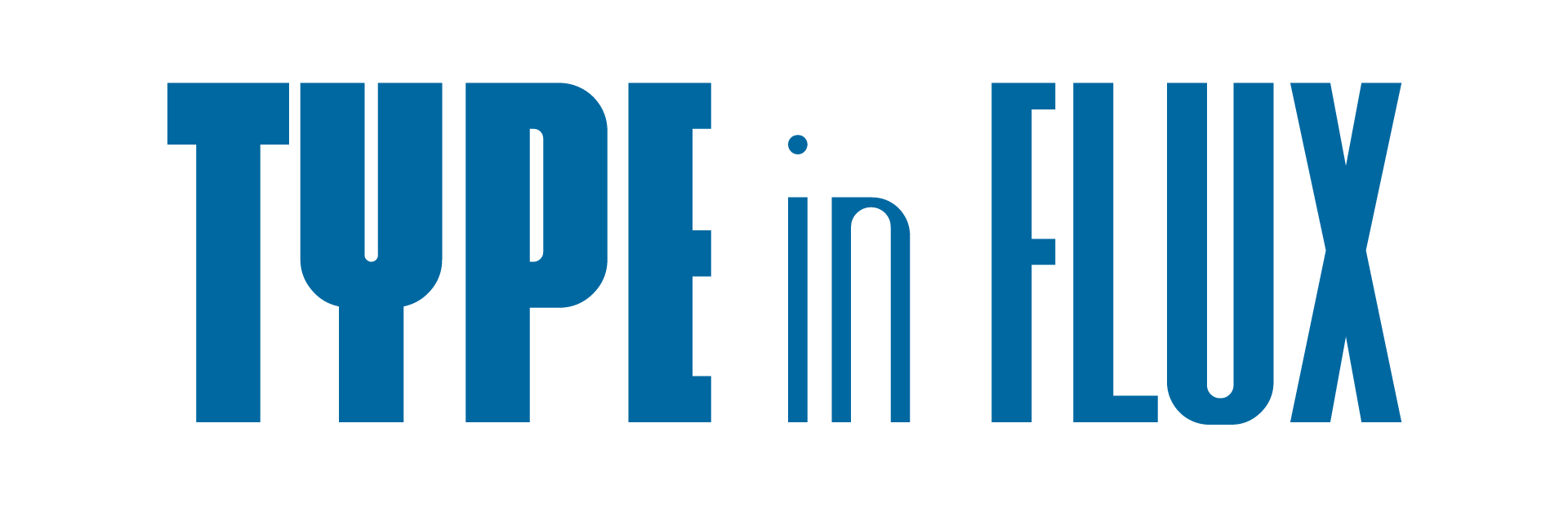
Logo mark for the conference, using different weights of the variable typeface YWFT Fluctuant.
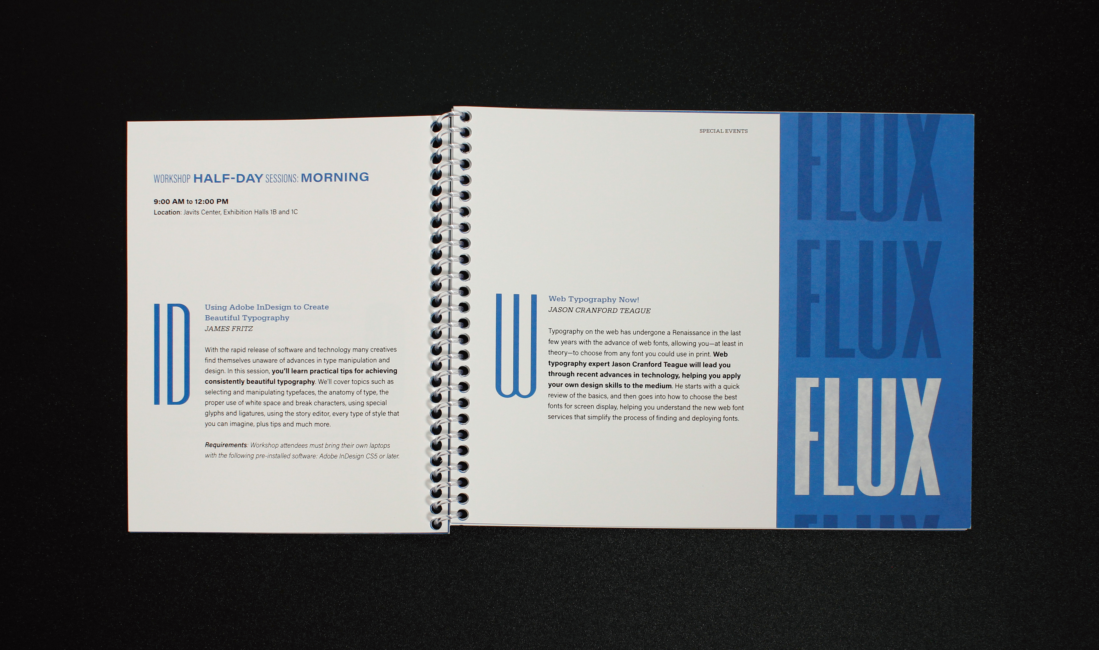
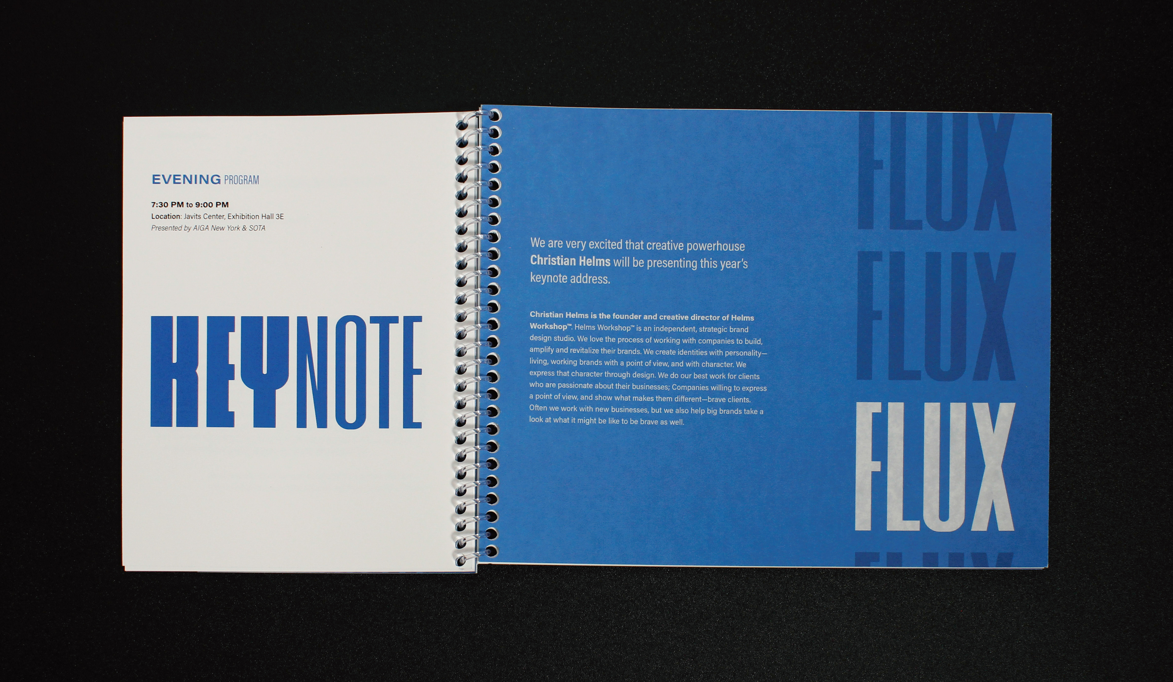
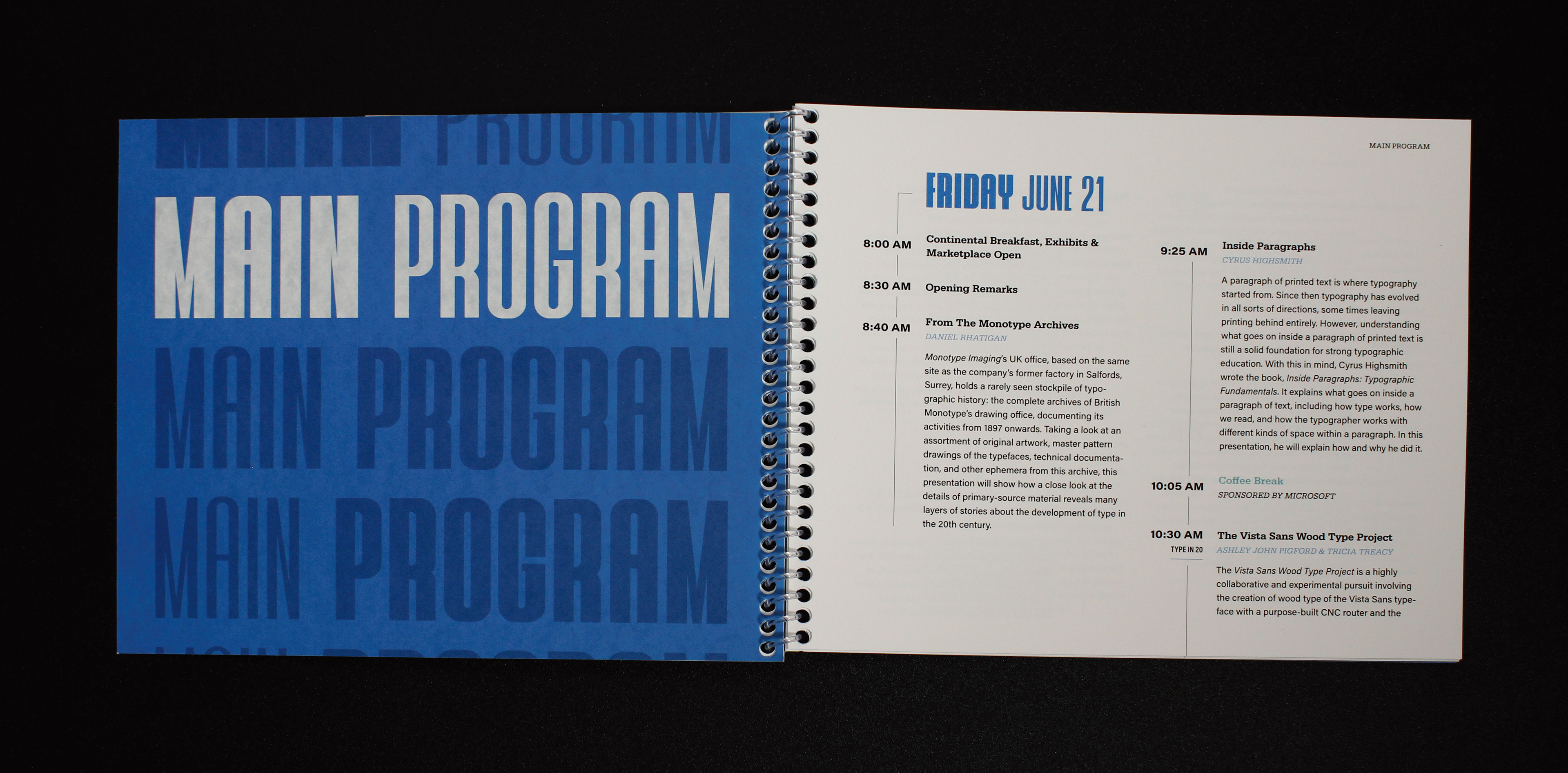
Properties of variable fonts such as weight, width and slant (just to name a few) are controlled by numerical values. This allows for vast possibilities and fine-tuned control over typography, going beyond simple drop-down menu options. Although they are not new, relatively recent advances are making variable fonts more known and accessible every day. In the conference collateral, variable fonts are used to create a sense of movement through gradual and sudden changes in contrast, as well as to adapt to different spaces.
An animated bumper serves as a motion ident and an opening title for speakers. It brings the theme of repetition with variation to life, creating phrases with shared words and characters. It also expands on the main pun present in “TYPEinFLUX,” incorporating a series of words beginning with “in” that can also be separated into two words to create alternate meanings.
Print collateral
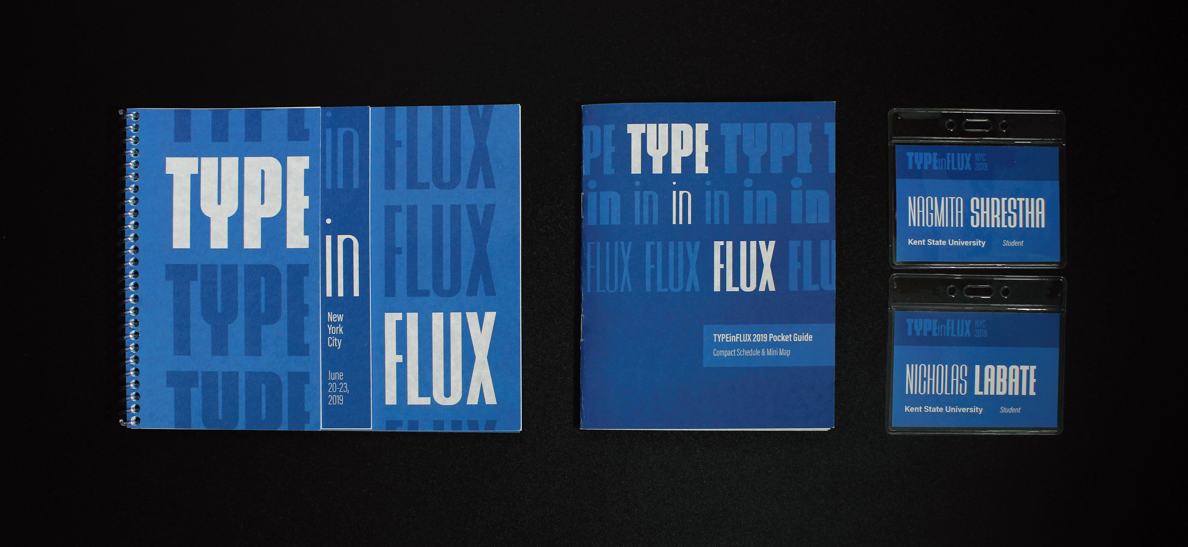
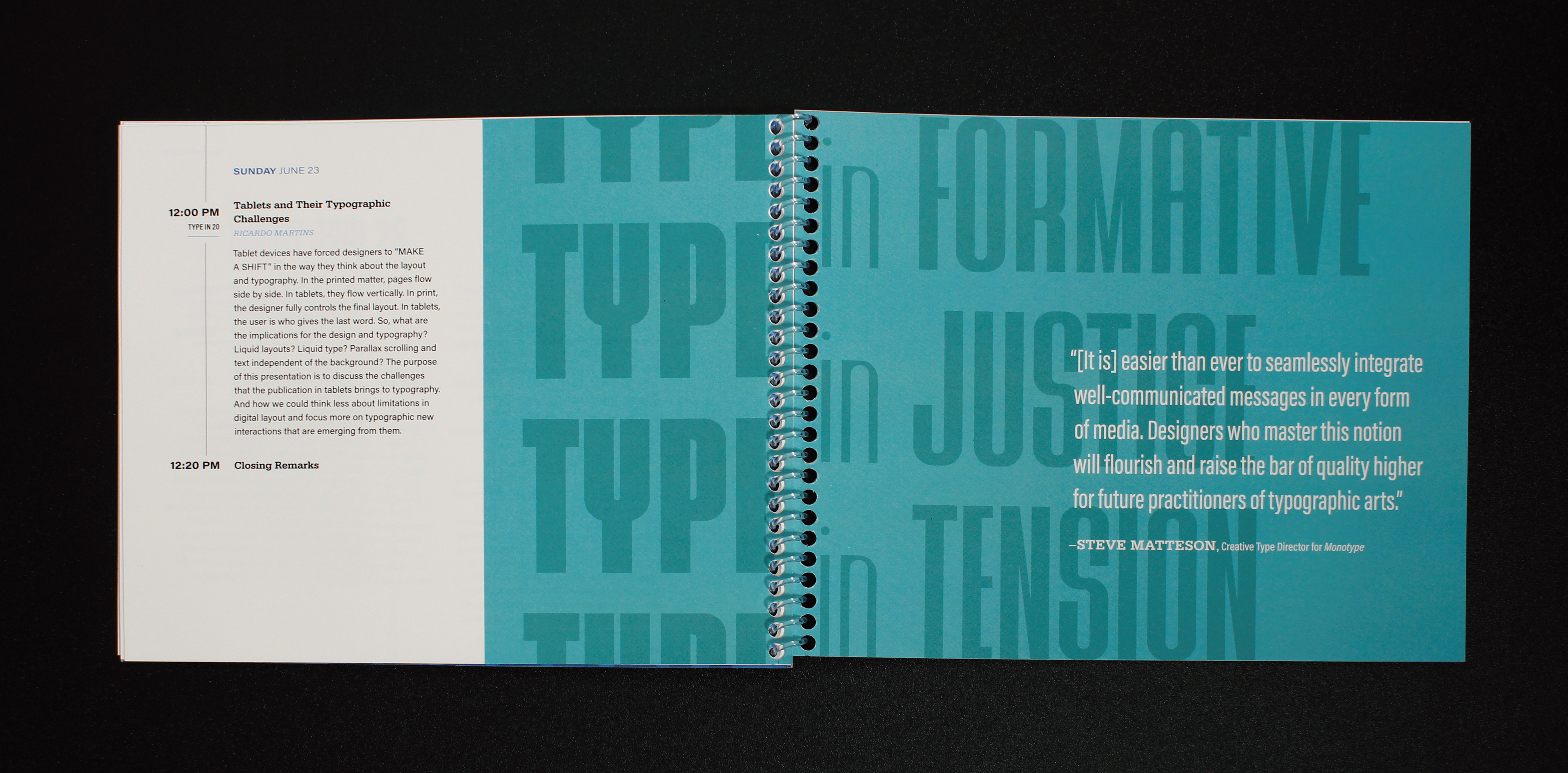
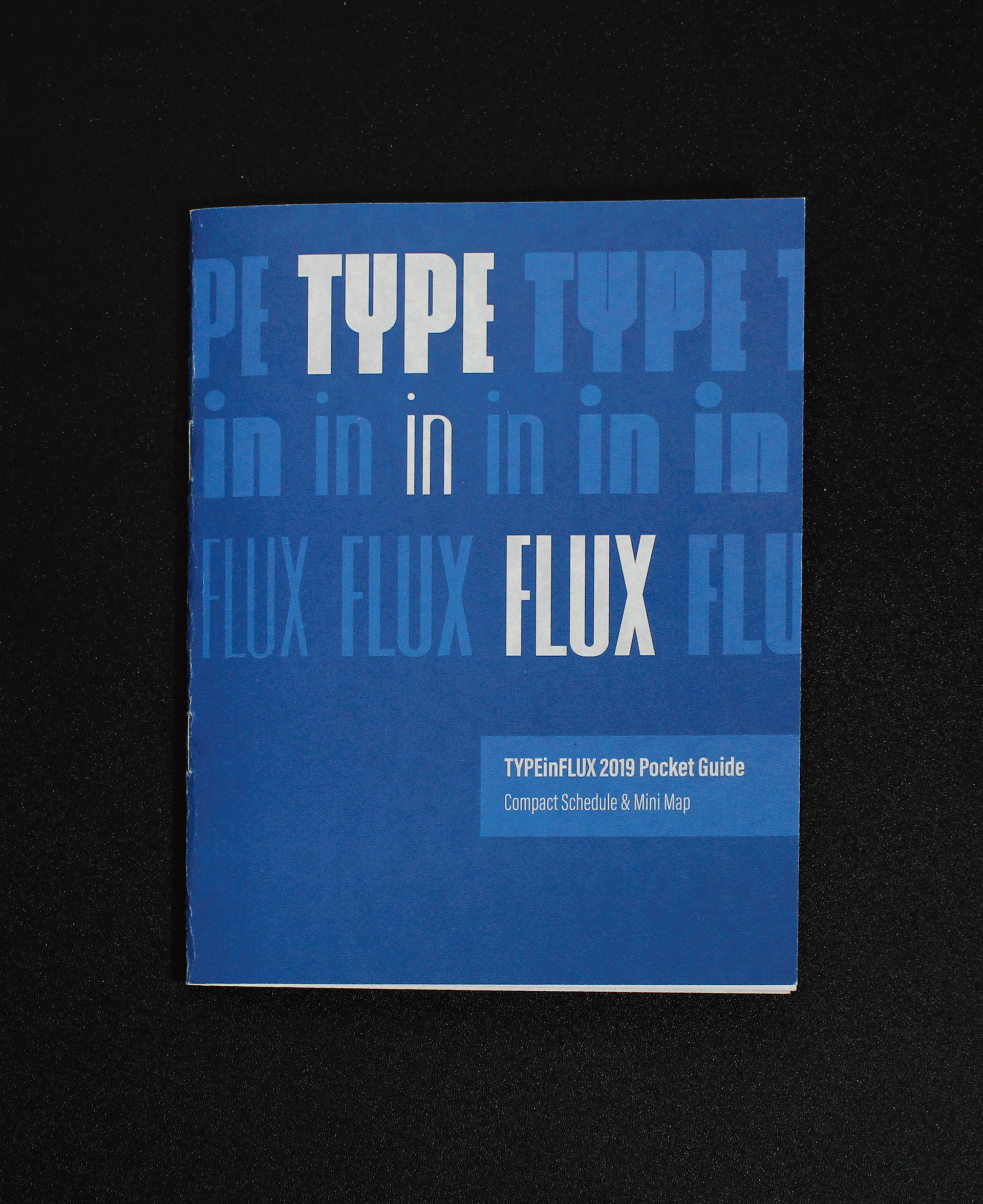
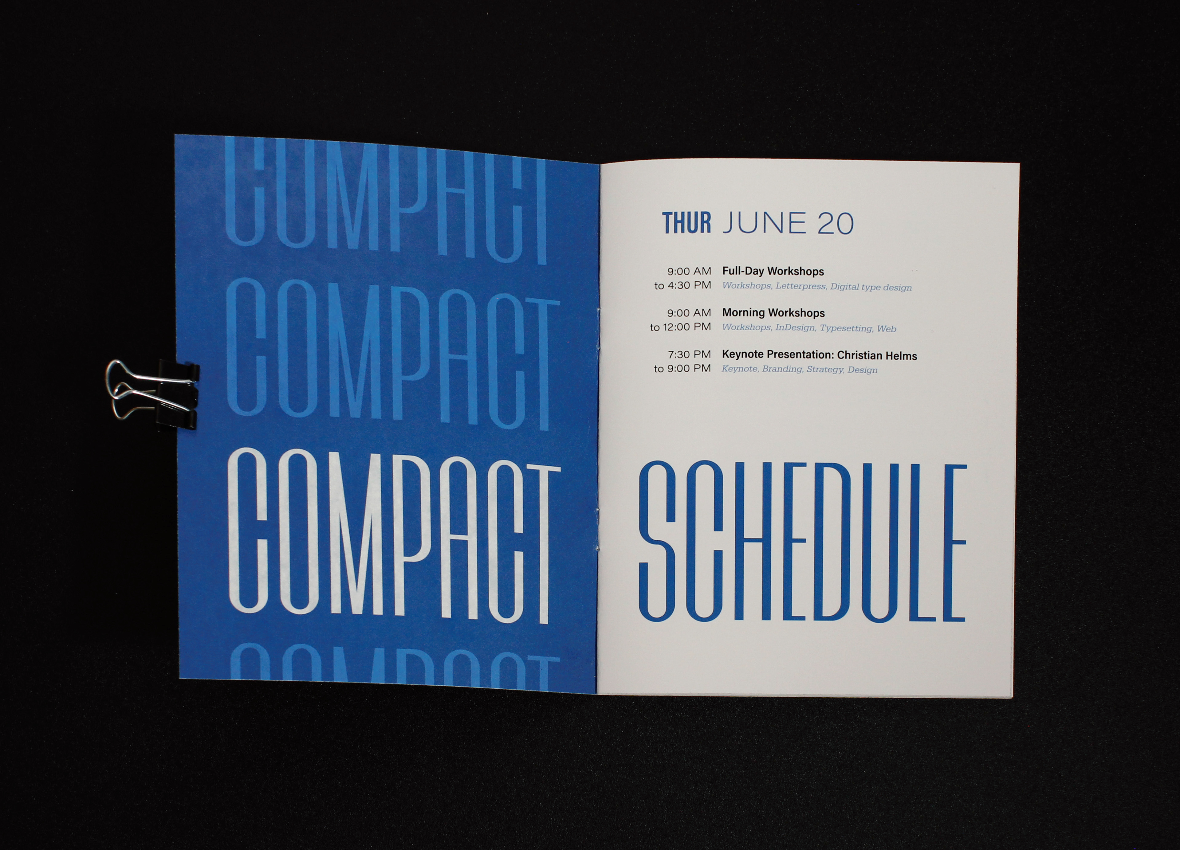
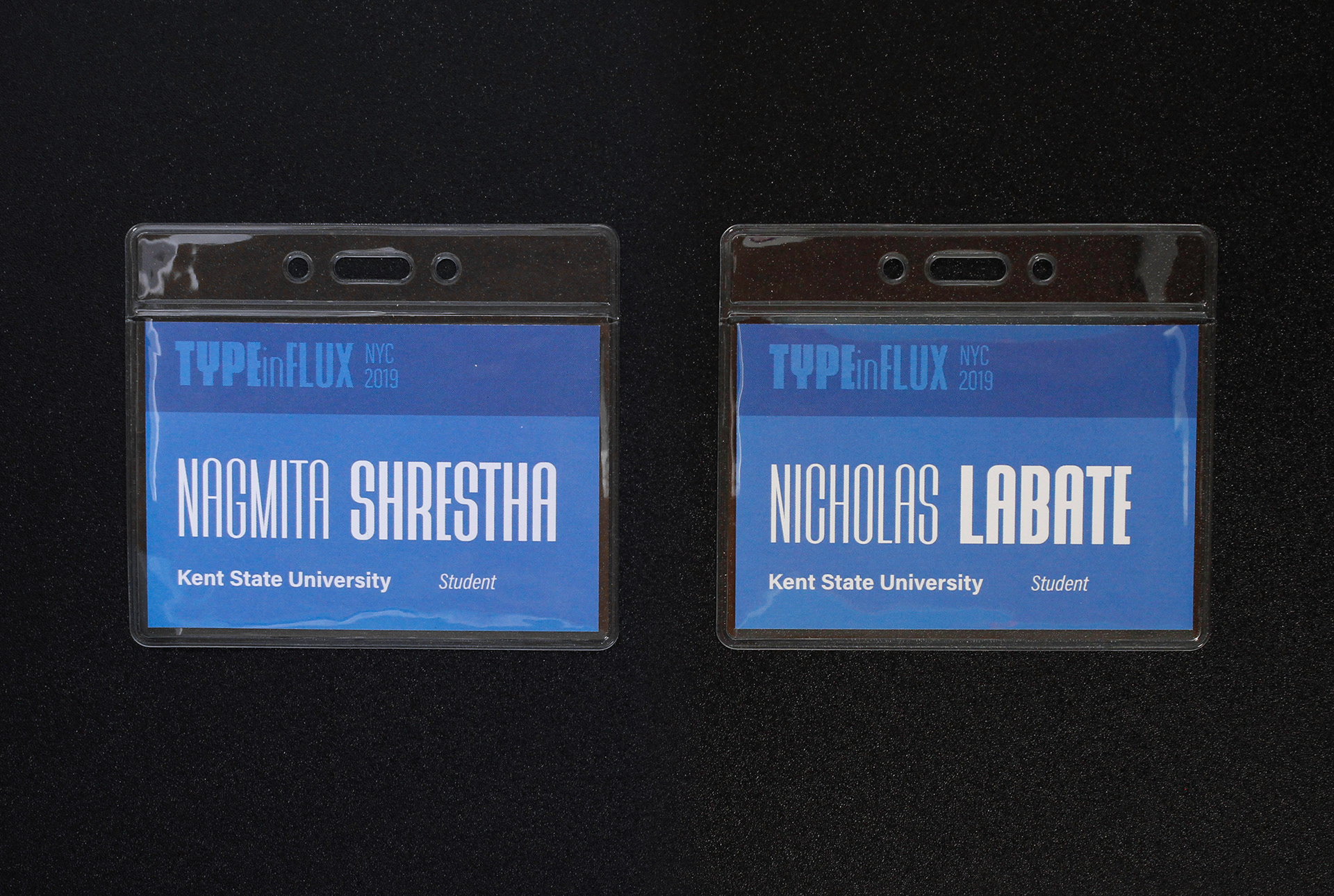
The printed collateral consists of a main program booklet, a pocket guide and a badge ID. The main program booklet contains pages of three different lengths which tie in with the conference’s wordmark and major sections within the content. The variation in page length is a nod towards the ever-changing canvases that typographers must design for, whether on a phone, magazine, or billboard. That movement and adaptive type is also brought into the pocket guide, and contrast is a focal point in the badge ID design.